Mac People magazine’s April 2013 issue
Article, Mokei-teki Monozukuri #4-1
Design & Text: Naoki Terada
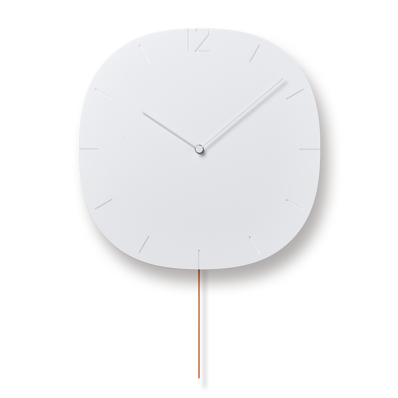
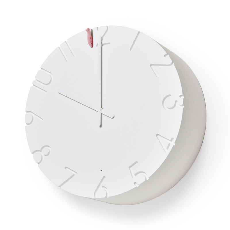
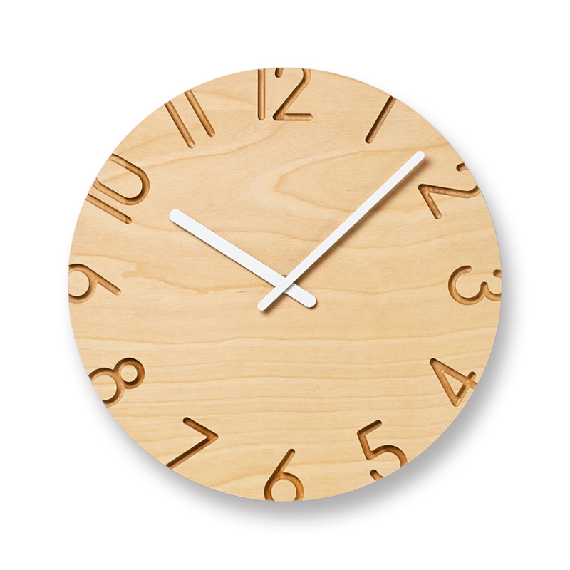
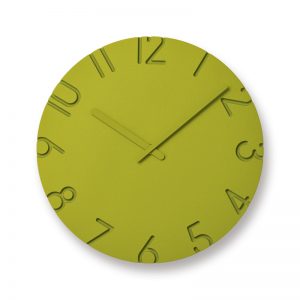
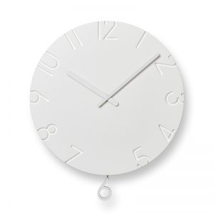
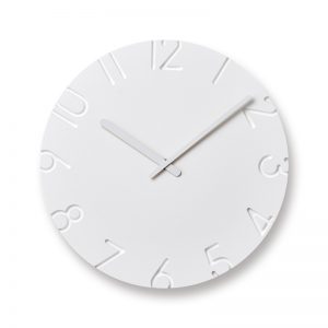
From here on, I would like to talk about the CARVED wall clock series. As well as working as an architect, I also design various products. My two themes in designing products are a design that proposes a new lifestyle, and one that will have an impact on the space as one of the parts making up that space. The CARVED wall clocks are an example of the latter.
My own style of wall clocks created by considering the background and materials
 No product can exist on its own without a background. There can be no situation in which a product is just floating alone in an empty space with a pure white background. I consider it essential to know where the product will be placed and how it relates to that place.
Therefore, I honestly want to be involved in designing the space itself through the design of the product.
I thought that designing a wall clock would be the perfect challenge for that. From the standpoint of an architect, I naturally consider the design of a wall clock as if I am selecting home furnishings to be installed. I also felt that I should take on this challenge.
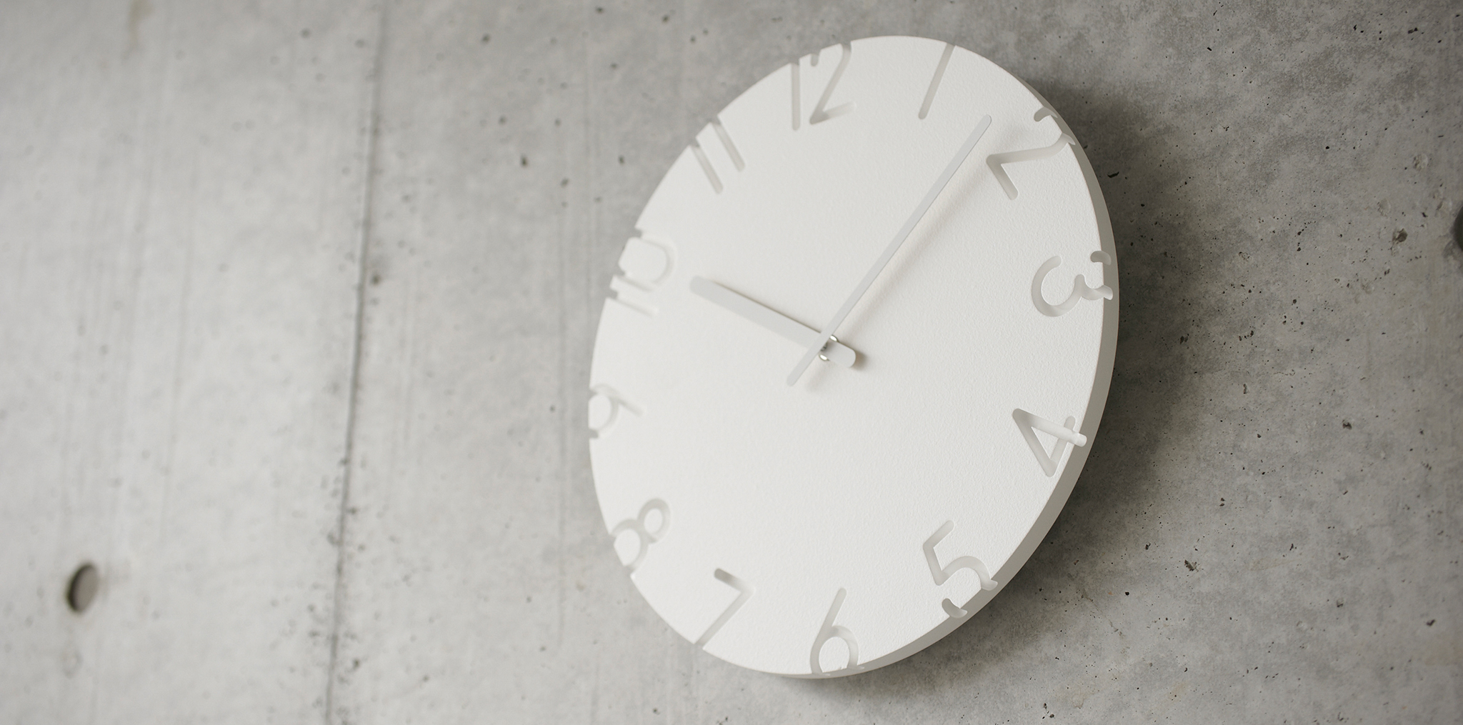
When designing the clocks, the first thing I considered was the wall in the background. There is always a wall behind a wall clock. Multiple types of walls are available―concrete or wooden, ones covered by wallpaper or painted, and metal panels. However, we are not in control of the wall as it depends on each user’s situation.
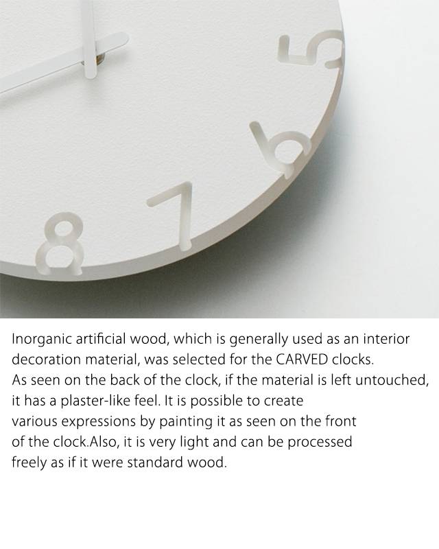 I therefore decided to make “texture” the theme of the design and to create a clock that would have a sense of density. For this, I selected a material that achieves a balance between the clock and walls of any texture, including the heaviness of concrete, the naturalness of wood, and the brush marks or paint particles of a painted wall.
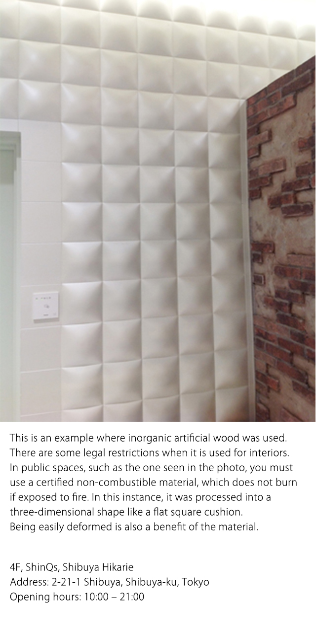
Accordingly, I selected inorganic artificial wood, which is generally used as an interior decoration material. Despite its plaster-like feel, it is very light and as easy to process as standard wood.Being light is a crucial element of a wall clock; if heavy, it may damage the wall or lead to a severe accident in the event it falls. Being easy to process is also important from a cost perspective.
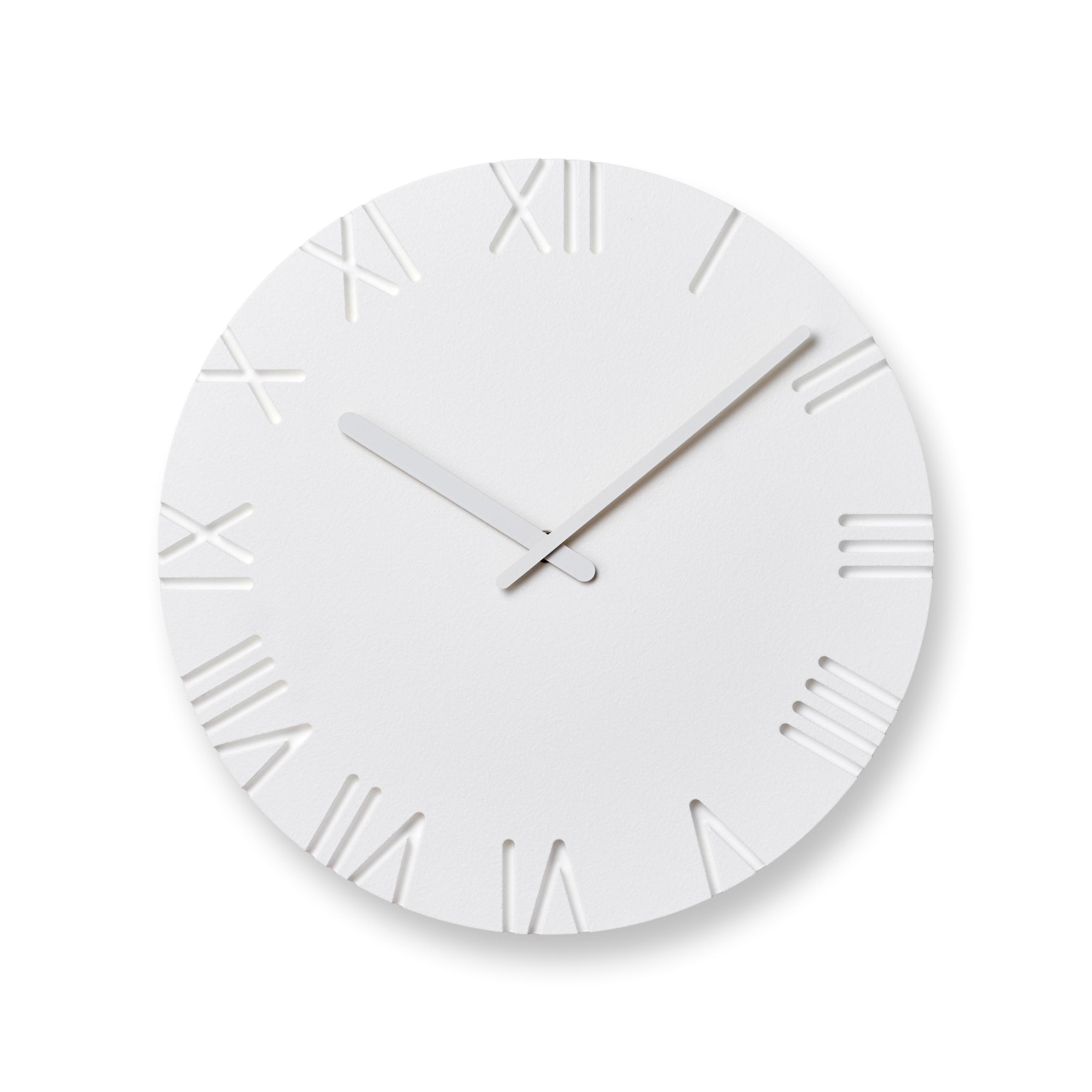
As a general rule, a clock has 12 indicators with its long and short hands moving in a circular motion. If it deviates from this standard, you cannot read time without feeling stress.Furthermore, the aim on this occasion was not to invent a “new way of reading time on a clock,” but to make a new proposal within the set rules of a clock. It was harder than I expected, but I made texture—not graphics—the theme of the design, which enabled me to achieve a breakthrough in coming up with an idea.

Naoki Terada
Architect, designer
In 1994, he completed MA course of the Association School of Architecture (AA school) in London. After returning to Japan, he produced and directed various brands as well as designing architectures and products. In 2003, he established TERADA DESIGN ARCHITECTS OFFICE. In 2011, he opened “TERADAMOKEI” in Simokitazawa, Tokyo. Currently, he’s President, COO of Interoffice Inc., an outside lecturer of Musashino Art University, and the juror of the Good Design Award.
He directs the brand, “15.0% ice cream spoon”which is produced and marketed by TAKATA Lemnos Inc., while designing all the products.
https://www.teradadesign.com/
https://www.teradamokei.jp/