Story

Story Vol.24
The Appeal and Story Behind “essent”: A Focus on Function and Material
Designed by Daisuke Kitagawa, the “essent” wall clock emerged from a deep reconsideration of function and material. Known for his multidisciplinary design work and creative direction, Kitagawa pursues what he calls “comfortable innovation.” Since its release, essent has been featured widely in media and has been selected by buyers for design shops. We spoke with Kitagawa about the charm of this exceptional clock.
Photography by Isao Hashinoki
– Could you tell us about the main features and appeal of essent?
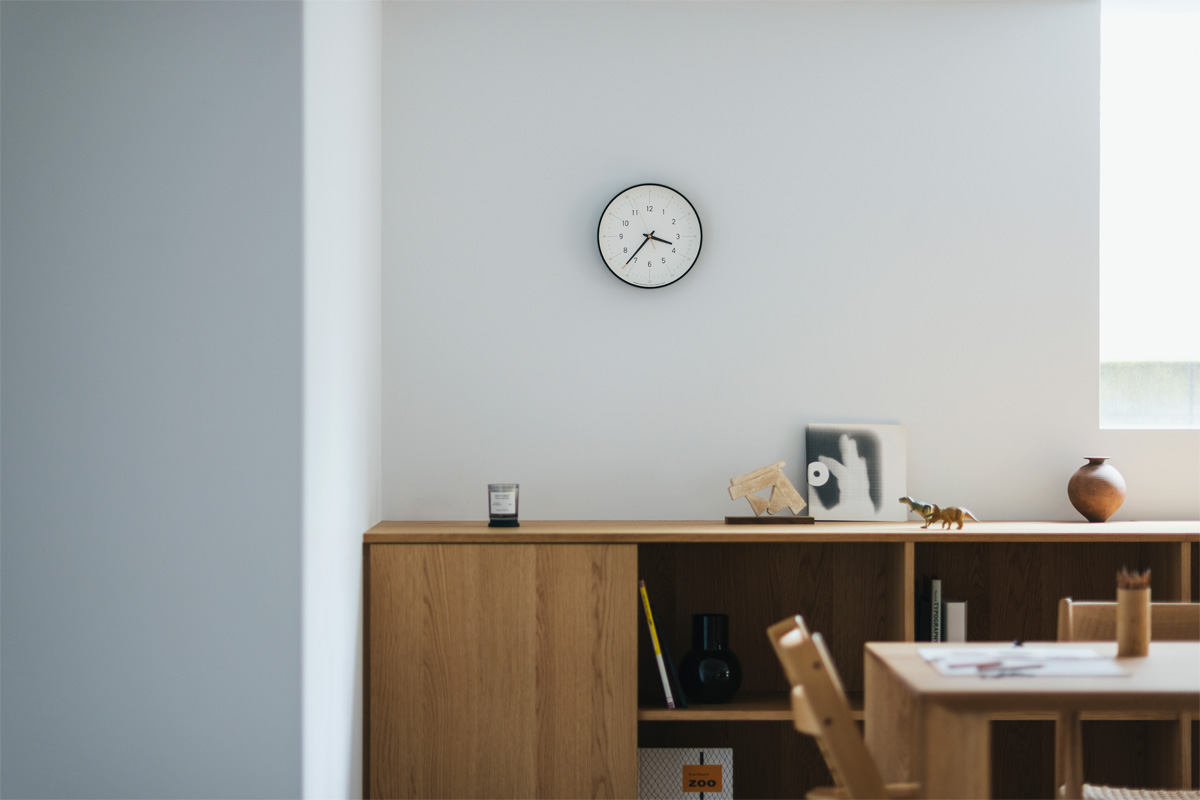
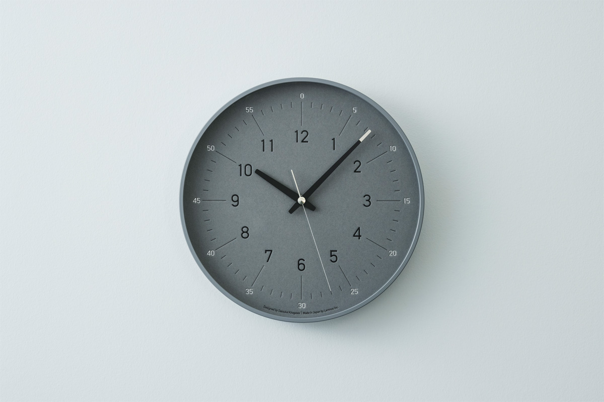
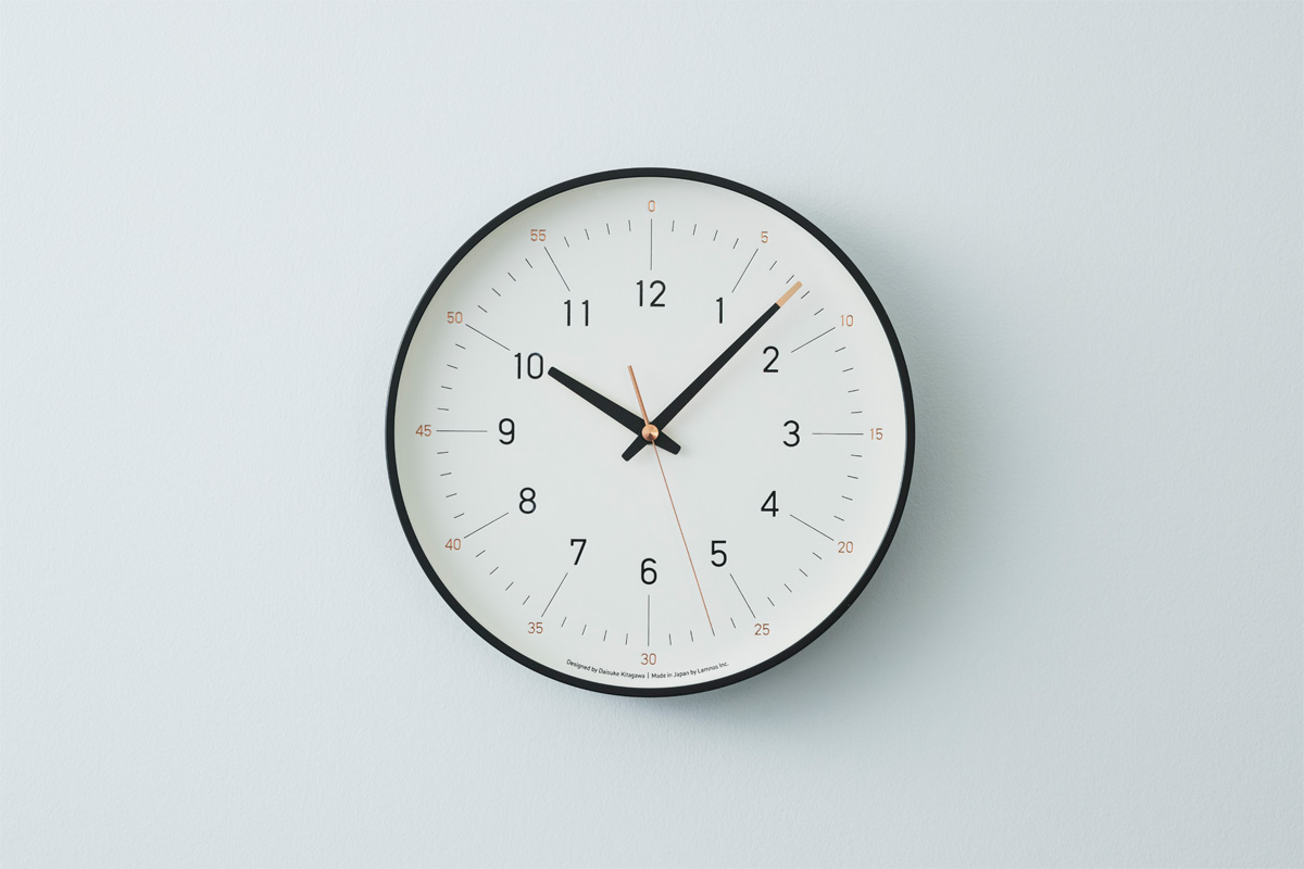
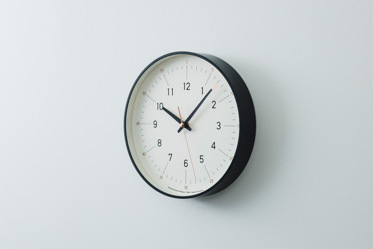
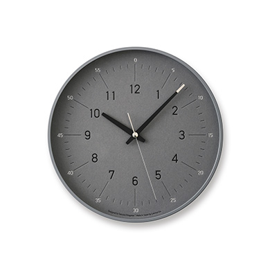
It’s a wall clock designed to become a new standard, which is easy for both children and adults to read, while blending naturally into a variety of spaces. Crafted from thick paper with a foil-stamped finish, the dial integrates the 12-hour and 60-minute systems and offers simplicity imbued with an expressive character and individuality. By rethinking the limited functions, materials, and manufacturing of a wall clock, we created a piece that brings subtle comfort through the design. It feels refreshingly new and comfortably familiar.
– How did the design for essent come about?
The design for essent began with two inspirations. The first came from my experience and memories of raising a child. When my child started learning to tell time, I noticed there were no clocks that fit a home interior and clearly distinguished the 12-hour and 60-minute systems, or the hour, minute, and second hands. That inspired me to design a wall clock that children can read easily, yet harmonizes naturally with any space, not just for children but for everyone. The second inspiration was in the materials and manufacturing. Most wall clock faces are printed on boards or sheets via offset or silkscreen printing. I wanted a new approach to express the face, which is essential to the clock’s character, by using materials and methods that felt new yet timeless. These inspirations merged to form essent.
– You mentioned your design was inspired by raising a child. How did you make the clock both child-friendly and versatile?
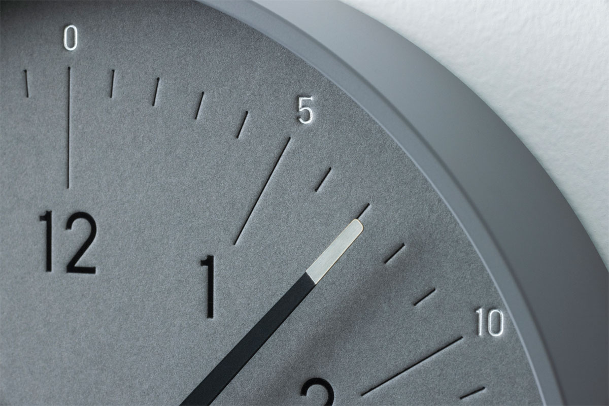
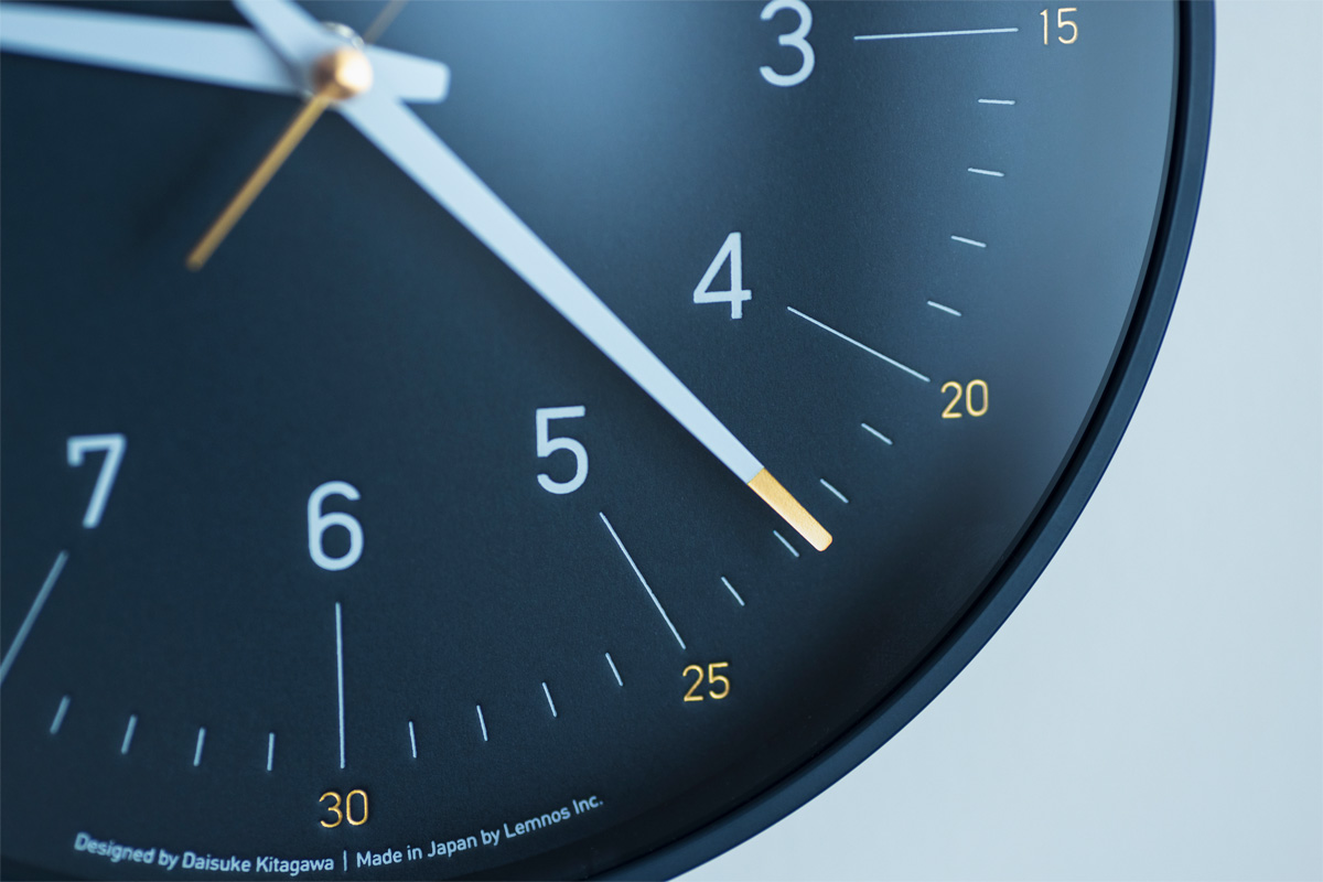
Most wall clocks display only the hours (1–12). For essent, I integrated the hours (1–12) and the minutes/seconds (0–55) on the same dial, using size and color differences to make them easy to distinguish. The hands are also carefully designed. I learned from experience that children often confuse the hour, minute, and second hands if they are described as “thick” or “long.” To solve this, each hand has a distinct design: the hour hand is a solid color; the minute hand is colored only at the tip to match the minute numerals (0–55), and the second hand is fully in that same color. These details on the numerals and hands make reading intuitive for children. Based on these elements and functions, I carefully refined the font, overall design, balance, and spacing to ensure that the clock would blend seamlessly into any space.
– Could you tell us about the materials and manufacturing?
The dial is crafted from thick paper and finished with foil stamping. From the start, we focused on the dial, which is the “face” of the wall clock, and explored new ways to express it by rethinking the materials and printing techniques. To create a more three-dimensional, expressive feel, we used letterpress, which is one of the original forms of printing. We selected thick paper that enhances the tactile quality of letterpress, while remaining consistent and expressive. Three types were carefully chosen for their natural texture and premium feel, yet with the uniformity required for production. All are FSC-certified and sourced from responsibly managed forests that meet the strict environmental standards of the Forest Stewardship Council®. To emphasize the tactile beauty of letterpress, the dial combines foil stamping and blind embossing, thus resulting in a never-before-seen expressive character and texture.
– The texture of the foil stamping is fascinating.
The essent clock is available in three color variations. The hour markers (1–12) and line indices use white or black foil, while the numerals (0–55) feature gold, silver, or copper foil. This combination gives the face a rich depth and never-before-seen expressive character, including a luster and metallic quality that is impossible to achieve with ink. Applying foil stamping across such a large area is a complex process, which was made possible through collaboration with Wako Co., Ltd., who are renowned worldwide for their advanced foil-stamping techniques.
– You created an original typeface for the clock face. What was your intention behind it?
From the outset, I wanted to create an original typeface that feels new and timeless, while ensuring perfect legibility. For essent, I drew inspiration from two iconic sans-serif fonts—Helvetica and DIN—and distilled their best qualities into something uniquely my own. Through countless micro-adjustments down to 0.001 millimeters, I achieved a clean, balanced typeface that feels effortless to read and gentle on the eye.
– The thin and delicate frame also makes an impression.
Crafted carefully one by one using aluminum casting―a traditional technique from Takaoka City, Toyama Prefecture―the thin, delicate frame complements the expressive face. The production is handled by Takata Factory, a Lemnos group company. Since the face and hands each have their own character, I wanted the frame to remain simple and delicate, which led me to choose aluminum. Its precisely cast circular form, free from distortion, embodies a simple yet dignified beauty.

– Lastly, please share a message with us.
The design of essent grew naturally from my experiences and extensive communication with Lemnos. I designed it carefully with the aim of creating a clock that could be used by people of all ages and blend effortlessly into any environment, whether private or public. I hope it’ll find its way into many hands and places and quietly mark time alongside people’s daily lives and memories.
The uncompromising craftsmanship shared between Kitagawa and Lemnos elevated essent through countless conversations and a mutual commitment to perfecting every detail. Although simple in style, their approach embodies a distinct character and creates new value through unwavering dedication to precision and detail.
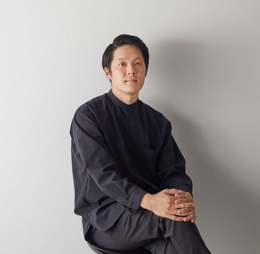
Daisuke Kitagawa
Graduated from Kanazawa College of Art in 2005. After working for a Japanese consumer electronics manufacturer, Daisuke Kitagawa established DESIGN FOR INDUSTRY Inc. in 2015. Based on the principle of creating “enrichment” that can be shared with everyone involved, Kitagawa has been engaged in a variety of fields, both at home and abroad, from furniture and daily necessities to traditional crafts, home appliances, robotics, advanced technology R&D, new material development, business development, and city branding. He always provides design and creative direction from the perspective of “comfortable innovation.” He has won many awards, including the GOOD DESIGN AWARD, GERMAN DESIGN AWARD, and iF DESIGN AWARD.
http://www.designforindustry.jp/