Story
Story Vol.10
Tokeidai no Tokei (Clock-Tower Clock) – Part 2
Product designer Kazuya Koike shared insights into the design of the original typeface developed for 「Tokeidai no Tokei」.
Original Typeface Design
「Tokeidai no Tokei – Part 2」
[ Design & Text: Kazuya Koike ]
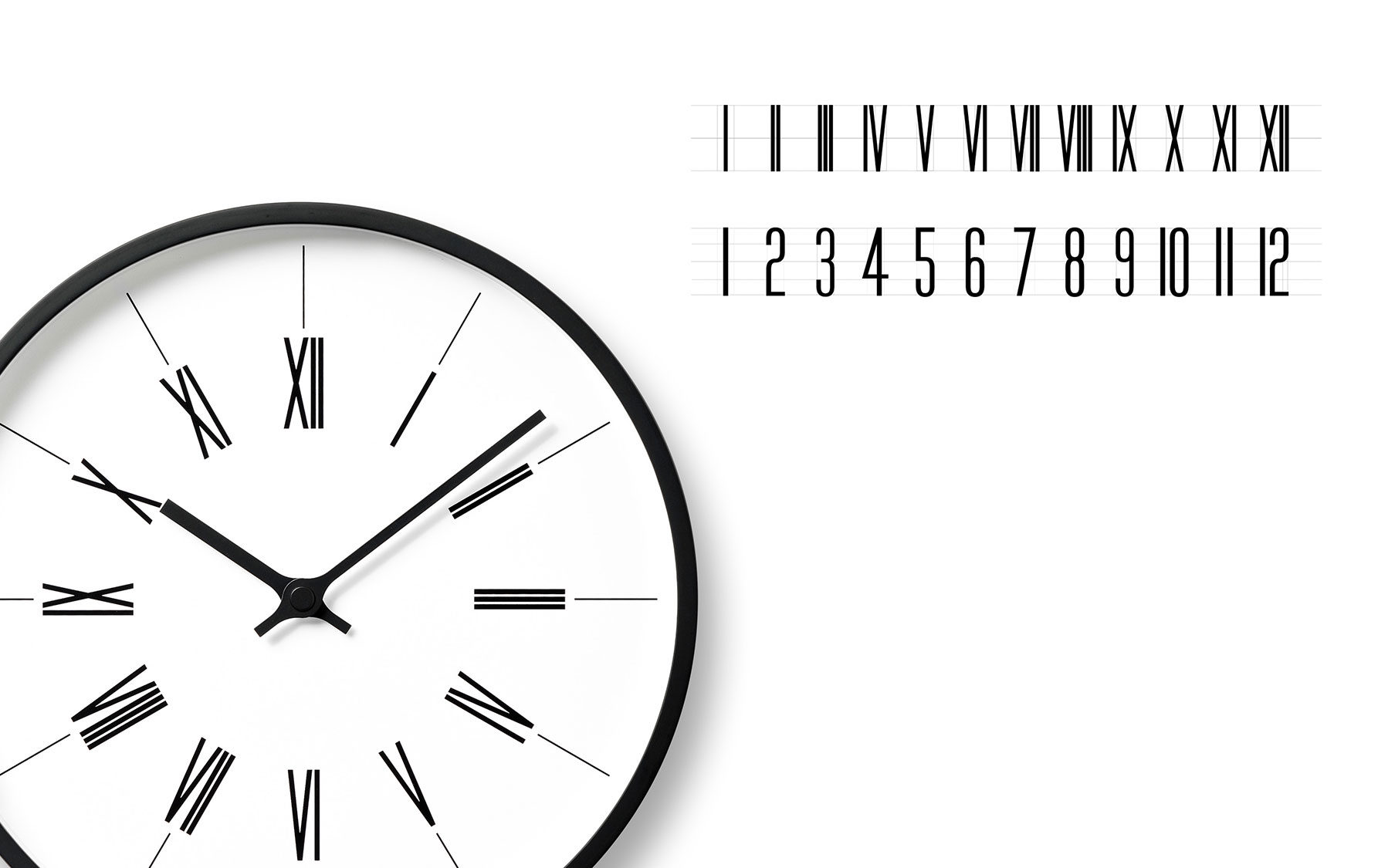
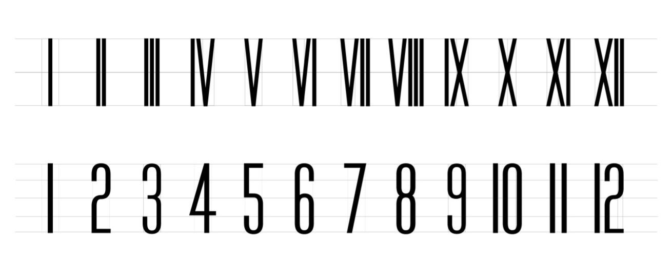
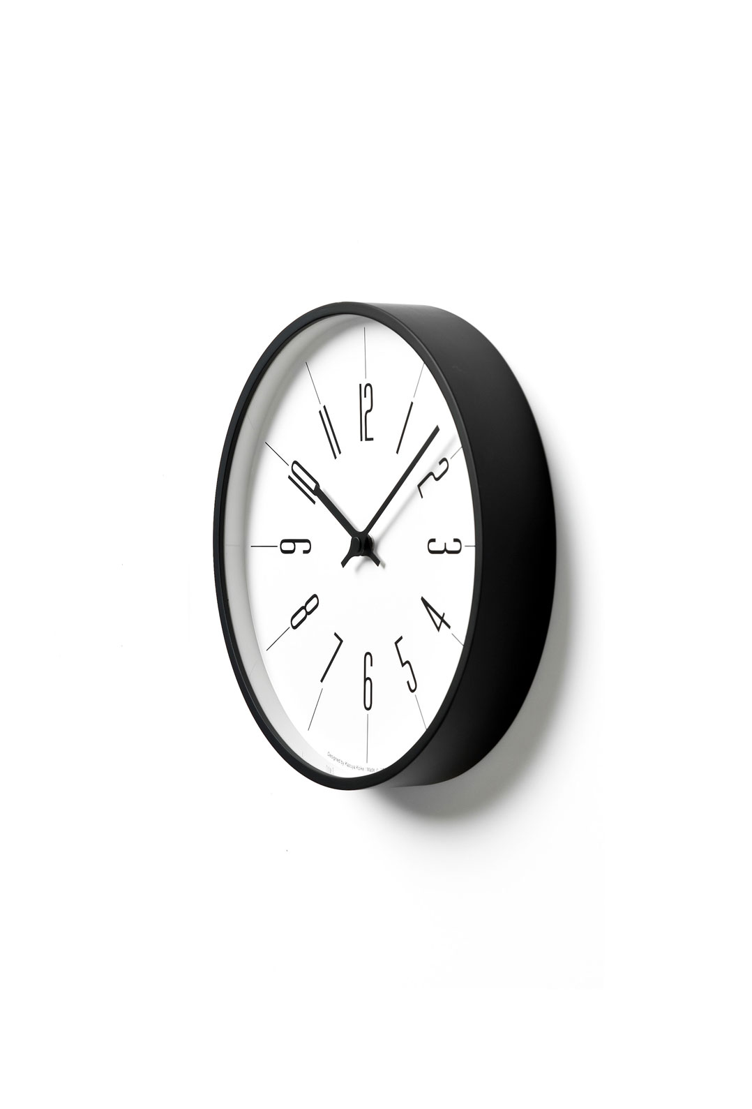
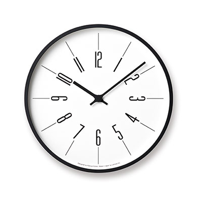
I’ll begin with the original typeface design. The numerals on 「Tokeidai no Tokei」 are composed of uniform stroke widths, created to harmonize with the frame design.
At first glance, the lines may appear to be the same width, but if all 12 numerals were truly uniform, then the dial would feel cluttered with lines and create a flickering impression. To prevent this, I made subtle adjustments by slightly varying the thickness of the vertical and horizontal strokes, so the numerals would appear natural and easy on the eyes.
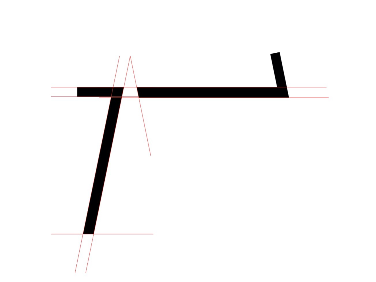
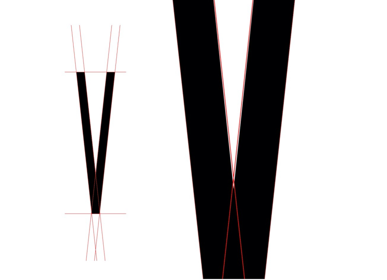
For the Roman numerals, such as V and X, I also adjusted the thickness at the intersections and the line ends. This subtle variation ensures that the typeface appears natural and visually comfortable—even with its clean, uniform strokes.
As I reflected further, I realized that I might have made these subtle adjustments because of my personal sensitivity to sharp points.
Plywood Frame
– The Craftsman’s Skill
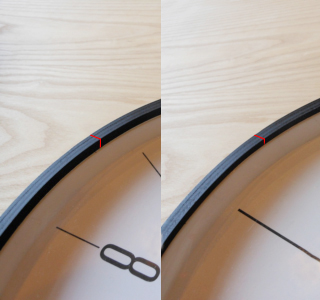
Next, let’s look at the plywood frame. In an early prototype, the height of the rise from the glass surface and the thickness of the frame are nearly identical. Due to the plywood structure, a shorter rise would have been more prone to cracking, so conventional designs would typically extend this distance to ensure strength.
As the frame would be painted black, a longer rise from the glass surface increased the black area, which gave the frame an overall heavy appearance. To address this, we prototyped frames with the rise reduced by 2 mm and 4 mm. After much trial and error with the craftsmen, we succeeded in mass-producing the frame shortened by 4 mm, which approached the structural limit.
In the 4 mm-shortened version, the rise from the glass is now shorter than the frame thickness, which makes the frame lines more distinct and allows them to harmonize with the dial’s linear design.
Although subtle and easily overlooked, this is an extremely challenging process that highlights the skill and craftsmanship of the plywood artisans.
In the next prototype, multiple layers of paint were applied to soften the frame’s rigidity. As a result, while the clock may appear cool at first glance, it blends seamlessly into living spaces.
Although my name appears on the dial, Lemnos’ expertise was integrated into its design during the development process, and the plywood frame showcases the factory’s technical craftsmanship.
This is not the work of a single individual; it is a truly collaborative clock, created together with everyone involved in its production.
Kazuya Koike
Born in 1980.
2003-2012, A chief designer In The Design company in Osaka. He was engaged in the product plan and design of consulting clients. Also engaged all processes, Sales planning, design development, the quality control and, intellectual property management of the self-developed product. 2012, Established Doogdesign.
Now, working in some domestic / overseas projects in an industrial art object, stationery, daily necessities, furniture, a household appliance, many divergences including the IoT product now. Winning Good Design Award, iF Design Award, Taiwan Excellence Award etc.
https://en.doogdesign.jp/