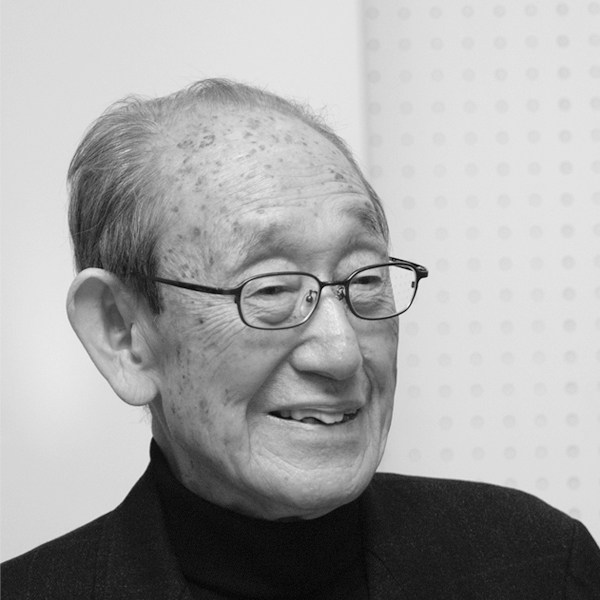
 Akira Yamamoto, who supported Riki Watanabe, told the birth story of “RIKI CLOCK,” one of Lemnos’ core clocks.
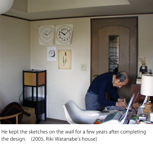
Left: Watanabe / Right: Yamamoto
[ Words: Akira Yamamoto ]
Clock design is 80% complete
when the best font is found for the numbers
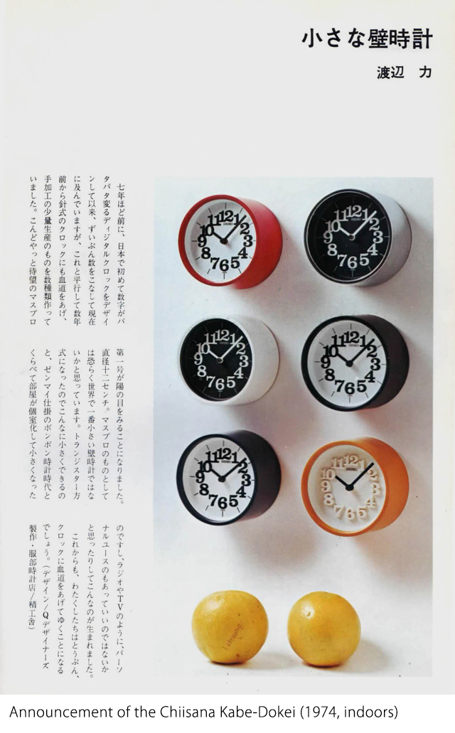 We have worked on designing COPAL digital clocks and WAKO customized clocks, etc. since the 60s. In the process, we developed a new concept named “personal clock.” Before then, clocks were mainly given as gifts in Japan. The wall clock had the image of being “bulky” and would be placed at the center of a house with its strong presence. But the lifestyles of Japanese people have changed, with a greater emphasis now placed on the individual. Smart and modern clocks suited to narrow spaces like a four-and-a-half tatami-mat room were welcomed. In the 70s, Seiko (K, Hattori at the time) released the “Chiisana Kabe-Dokei” (Small wall clock).
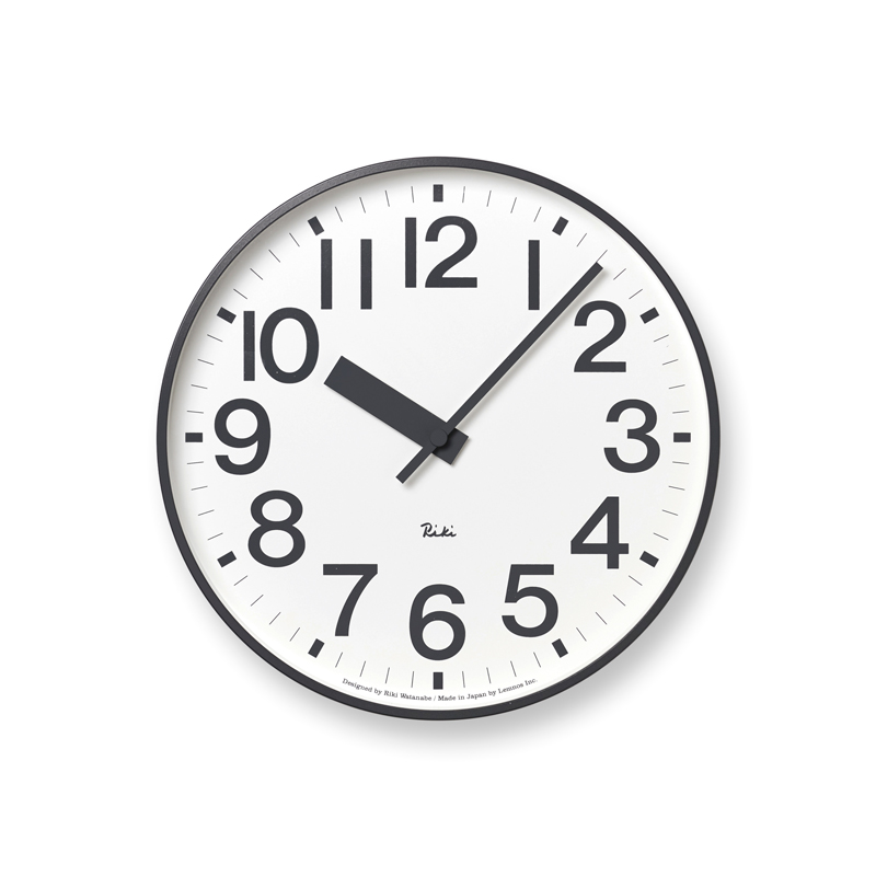
 As Watanabe said, “Clock design is 80% complete when the best font is found for the numbers.” He was very particular about numbers. Surprisingly, the numbers 0 to 9 look well balanced in only a few different fonts. In one font, the numbers will look good when viewed closely but not so good when viewed from a distance. In another font, they look different when arranged in a circle. If that font is selected, some of the numbers may need to be altered. Meanwhile, we found “CBS DIDOT,” which is the font used in the RIKI CLOCK.
The font was found in the early 70s in a book brought back from the U.S. by Hiroshi Hara, a graphic designer and Watanabe’s friend. It was designed by Freeman Craw. For the CI strategy at CBS broadcasting Inc, he received a design request from Lou Dorfsman, vice president and an art director of the company. Watanabe fell in love with the font for its extreme but elegant balance of thickness and thinness, the way it was visible even from a distance, and the fact that all of the numbers were neatly designed. He obtained permission from CBS and applied the font to the clock design.
(According to one account, he wrote to CBS and said, “The font is so great that I would like to use it on a clock face. Please contact me if this causes any problems.” But there was no reply from CBS.)
He designed various clocks, but production on them was discontinued one after another, while the mass production of clocks ended in the late 80s, even though they were loved by many architects and designers. A reason for this was the fact that clocks were expensive items (a clock in the 1970s cost almost as much as in today’s prices). A further reason was the low awareness of modern design.
Clock design with Lemnos came to life
due to an unexpected encounter
 After that, he personally continued to design clocks and presented them at an exhibition at Matsuya design gallery, among other activities.
In 1999, Seiko Watch Corporation paid attention to Riki Watanabe as part of activities to review their own heritage. Seiko asked him to design a watch and he thus restarted work on watch design. He carefully selected a font and did over 200 sketches. His first product featured CBS DIDOT as expected. He also released an experimental model using a circle, which was something he had been researching at the same time. “Universal design” was one of the big themes of the era as well as high visibility. He was far enough into his career to say, “high visibility is naturally expected in a watch, so there is no need to mention it.” Having earned a good reputation, the decision was made to continue making his products as a series, which continues to this day.
On the other hand, he had started designing clocks due to an unexpected encounter with Takata, president of TAKATA Lemnos, and his strong enthusiasm.
In 2002, at the Toyama design competition award venue, Shinichi Sumikawa, who was Watanabe’s senior in college, introduced President Takata to us. As part of our small talk, we asked President Takata about a proposal for a clock design by a newcomer. President Takata said, “we like to develop our products as part of a total design, rather than designing a clock on its own,” and he gently declined the idea. But as soon as Watanabe, who by then had restarted designing watches, started saying he was interested in clock design, President Takata said, “I am also interested in that!”
“Anyway, I will consult with the Lemnos staff about it.” It was less than a week later when the president called to ask us, “what happened with that matter?” We then had a meeting at a coffee shop in Shinjuku and everything progressed very quickly from that point.
Later, I heard that one of the reasons was that he had been urgently looking to develop a product that could become the new core for Lemnos. Especially for new designers, his refusal of their proposal was like a greeting. He received a lot of proposals from newcomers who thought “Clock design seems easy, let’s give it a try!” Actually, he responded with sincerity to designers who tenaciously continued to challenge.
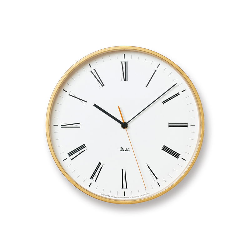
To express the image of “lightness,”
BERNHARD TANGO was adopted as the font for the clock face
and plywood for the clock frame.
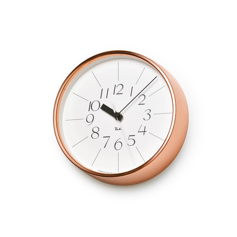
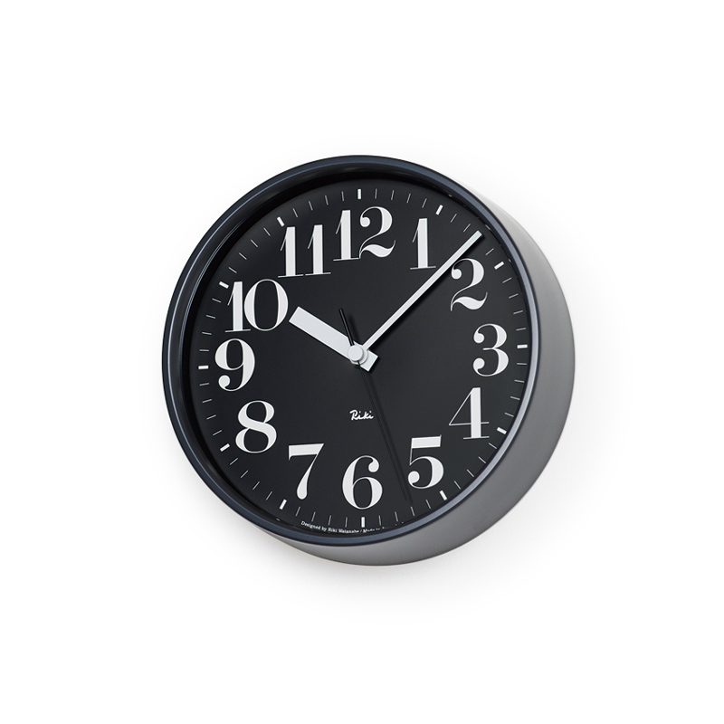
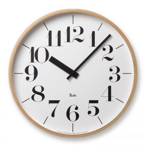
 Riki Watanabe envisaged “lightness” for his new clock. President Takata was looking for any potential for a plywood clock frame that had been discovered and realized a few years ago. The harmony of their thought led to the birth of the RIKI CLOCK.
We made full-scale sketches of the clock, checked it on the wall, and repeatedly revised the design. Even after its release, we reproduced the clock face’s printing plate with precise modification. At that time, it was common practice to use existing clock hands similar to the designer’s image, but none of them fit in a delicate size. With our experience of public clock design, we utilized low-cost customized hands, which were simply cut, to realize the balance of the clock face, which is the second most important thing after numbers.
BERNHARD TANGO was used as the font for the clock numbers because of its “lightness.” A font usually needs color development, but he did not hesitate to decide that such action was not needed.
I remember one part that I found impressive while designing the detail of the clock with President Takata. When it comes to designing a clock face, various elements are based on a circle (e.g., the marks for the hour and minute, clock hands, number). He was so impressed with all of the center points being aligned in CAD. They appear to go slightly out of place if you don’t pay attention. The president, who majored in mechanical design, demonstrated his persistence and attention to detail, which is easily missed out, and his “love for clocks” in every scene, both culturally and theoretically.
It is no exaggeration to say that the achievement of pushing the interior clock to a prestigious design product was no less than Riki Watanabe’s.
We waited for the right moment
to design a clock featuring CBS font.
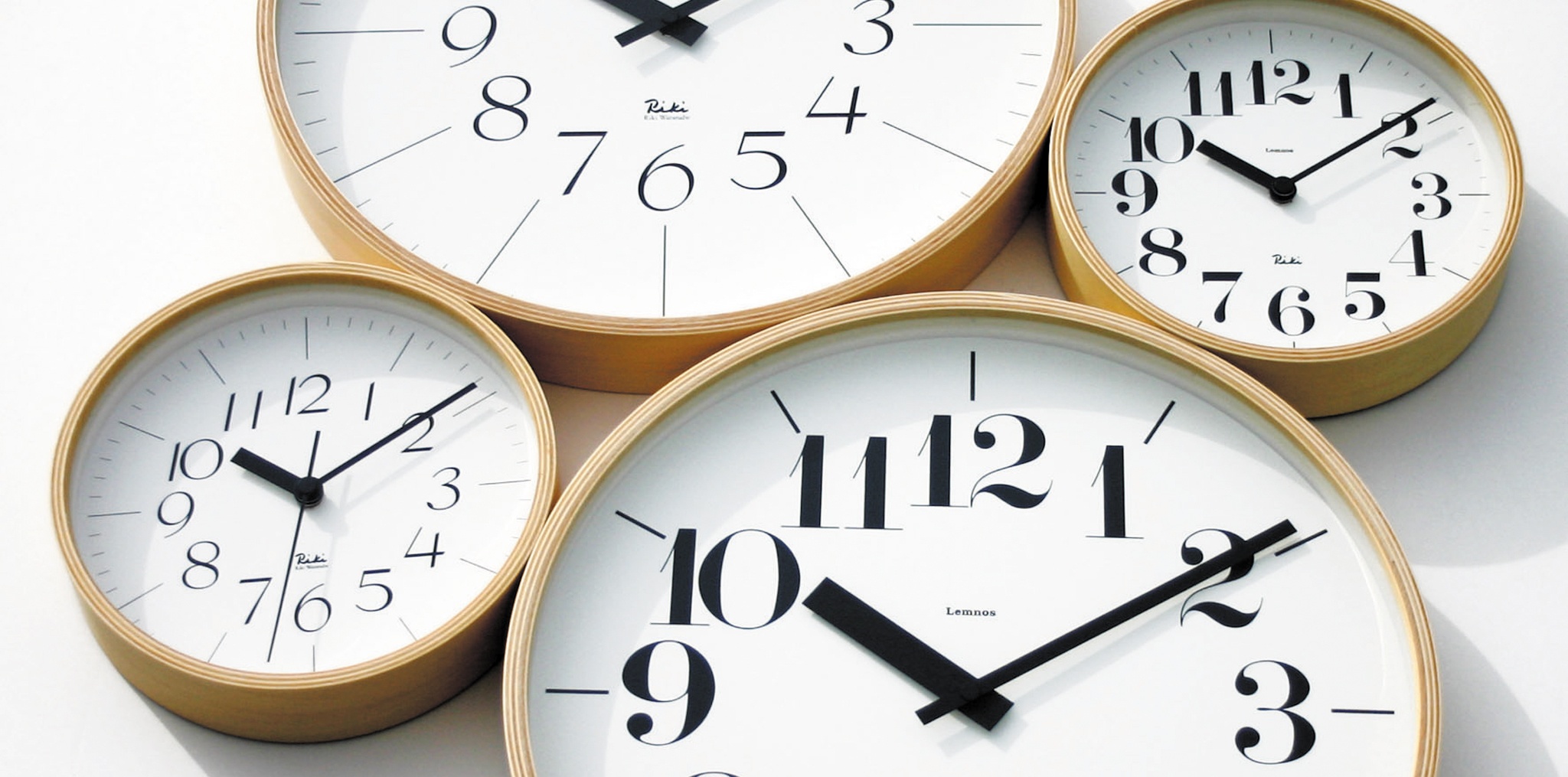
 Both Riki Watanabe and President Takata were satisfied with the quality of the product. Soon a second edition was requested, the type design for which was fully prepared using the CBS font. The impact of the font went beyond my imagination, especially when we used it on a large clock. I remember we had a very hard time achieving the balance of each number in the clock frame as a series of clocks.
President Takata had strong feelings about the clock. He was unable to decide on the length of the bottom parts of the hands and Watanabe proposed lengthening them by 2 mm. Recalling that episode later, he said, “I don’t even know how I dared to say that while my heart was pounding!”
As a result, the second edition of the clock became a plywood version of great presence, which feels comfortable in terms of weight. This was the opposite of the first edition, which had a “lightness” about it.
His lifework was clock design.
 He had new plans pending because, for example, the “Chiisana tokei” (small clock) involved costly resin molds. For a clock that used copper, which Riki Watanabe loved, it was hard to work with the material and was also expensive. However, his plans proceeded based on the high reputation of the RIKI CLOCK.
In fact, Riki Watanabe is rated very highly as a product designer for his works, which include string chairs and cardboard stools as well as clocks. However, he had no hits during that period as his work may have been ahead of its time. For Riki Watanabe, who considered clock design as his lifework, all of his hard work as a designer must have paid off as he had a second chance to design clocks in his final years and both his watch and clock designs have been big hits in the present day when time caught up with him.
Riki Watanabe
(1911–2013) Graduated from the Woodwork Department of Tokyo High Polytechnic School. After working as an assistant professor at Tokyo High Polytechnic School and as an assistant in the Forestry Department at Tokyo Imperial University (the existing Tokyo University), he established Japan’s first design office, the RIKI WATANABE Design Office, in 1949. His main focus was the establishment of the Interior Architect Department at Tokyo Molding University, Craft Center Japan, Japan Industrial Designer Association and Japan Designers Committee. He designed the interior decor at the Keio Plaza Hotel, Prince Hotel, etc. and furniture such as the “Himo-Isu (Rope chair)” and “Trii-stool”. Moreover, from wall clocks and watches to a public clock called “Hibiya pole clock” at Dai-ichi Life Holdings in Hibiya district, his work on clocks and watches became his lifework. He received the Milano Triennale Gold Medal in 1957, the Mainichi Industrial Design Prize, Shiju hosho(the Medal of Honor with Purple Ribbon), and many other awards/recognitions. In 2006, the “Riki Watanabe – Innovation of Living Design” exhibition was held at the National Museum of Modern Art.